VIREO SYSTEMS / CREABOOST
Creaboost needed a fresh, credible identity beyond the usual supplement playbook. I created a brand world informed by fashion, streetwear, and performance culture, built around electric blue, stark black, and bold, clean typography.
MY CONTRIBUTION
Original Logo creation, Vis ID branding & art direction
Trade-show booth

02 / LOGO DEVELOPMENT
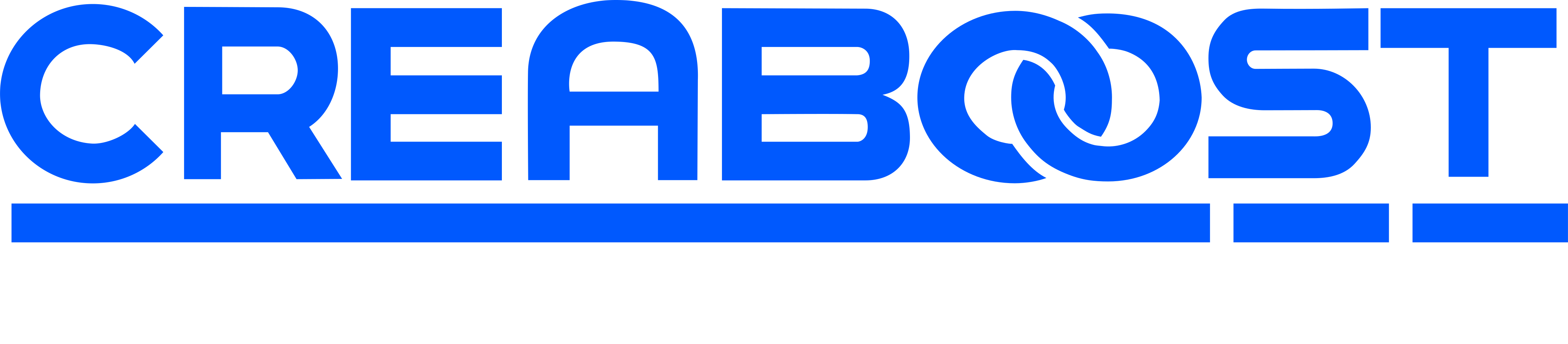
The interlocking forms give the wordmark its own identity. A segmented blue underline anchors the black lettering, keeping the signature clear on a light background.
03 / THE DESIGN LANGUAGE
04 / THE PALETTE
05 / THE BRAND IN USE
The original identity now lives across product photography, packaging, and everyday brand touchpoints. I also consulted on parts of the packaging line expansion.


06 / IN MOTION
See how the identity carries into the brand’s current social content, from product-first graphics to motion and real-world performance.
CURRENT BRAND ROLLOUT / SILENT VIDEO
07 / OUT IN THE WORLD
On the trade-show floor, the identity becomes a physical presence. I consulted on the booth, helping translate the brand into an environment people could walk into.

A clear identity that carries from the product shelf to the social feed to the trade-show floor. Distinctive in every setting, recognizably Creaboost.