

CON-CRĒT® Creatine
CON-CRĒT® Creatine
CON-CRĒT® Creatine
Art Direction/Photography
From a delicious daily ritual to a science-led shelf presence.
2024–2026
(01)
(The evolution)
© 2026
(01)
(The evolution)
Make everything irresistible.
Make everything irresistible.
Make everything irresistible.
First, make the powder look delicious and turn taking creatine into an inviting daily ritual. Then, as gummies and flavored drinks expanded the market, bring the focus back to the brand’s distinctive story: creatine HCl, scientific credibility and its pioneering position.
First, make the powder look delicious and turn taking creatine into an inviting daily ritual. Then, as gummies and flavored drinks expanded the market, bring the focus back to the brand’s distinctive story: creatine HCl, scientific credibility and its pioneering position.
MY CONTRIBUTION / Positioning recommendation · Target packaging art direction · Photography art direction · Final image retouching · Icon illustration · PDP video art direction
01 / 2024–EARLY 2026 / FLAVOR & RITUAL
Here is where we started.
Here is where we started.
Here is where we started.
Before the latest positioning shift, the creative challenge was appetite appeal. I art directed photography that brought flavor, freshness and the drinking ritual forward, making a functional powder feel like something to look forward to.
Before the latest positioning shift, the creative challenge was appetite appeal. I art directed photography that brought flavor, freshness and the drinking ritual forward, making a functional powder feel like something to look forward to.


First, make it irresistible.
Then, make the difference clear.


From gym shelf to wellness aisle.
From gym shelf to wellness aisle.
From gym shelf to wellness aisle.
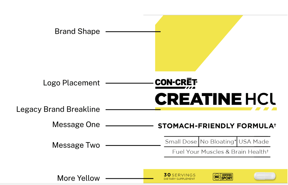
I suggested ‘creatine perfected’ as the positioning direction: elevate CON-CRĒT as a science-backed pioneer of creatine HCl. I art directed the new Target packaging to express that shift through a cleaner hierarchy, a quieter palette and a more considered shelf presence.
I suggested ‘creatine perfected’ as the positioning direction: elevate CON-CRĒT as a science-backed pioneer of creatine HCl. I art directed the new Target packaging to express that shift through a cleaner hierarchy, a quieter palette and a more considered shelf presence.

A different kind of shelf presence.
A different kind of shelf presence.
A different kind of shelf presence.
The new visual direction meets the conscious wellness shopper where they already shop. Target becomes a tangible expression of the move beyond traditional gym-focused cues.
The new visual direction meets the conscious wellness shopper where they already shop. Target becomes a tangible expression of the move beyond traditional gym-focused cues.

Photography with purpose.
Photography with purpose.
Photography with purpose.
For the latest shoot, I executed photography art direction under the new creative director. I also personally reworked the final retouching to bring the images back into alignment with the intended creative direction. Alongside this photographic work, I illustrated the icons and art directed the product-thumbnail video.
For the latest shoot, I executed photography art direction under the new creative director. I also personally reworked the final retouching to bring the images back into alignment with the intended creative direction. Alongside this photographic work, I illustrated the icons and art directed the product-thumbnail video.


Latest shoot: art direction executed by Cara Dunning under the new creative director, with final retouching reworked by Cara. Icon illustration and product video art direction: Cara Dunning. Video plays without audio.
The same product. A sharper reason to choose it.
The same product. A sharper reason to choose it.
The same product. A sharper reason to choose it.
From appetite appeal to a more precise visual identity, my work helped CON-CRĒT respond to a changing category without losing its distinctiveness. The latest packaging brings the brand’s HCl story into a more elevated everyday-wellness context.
From appetite appeal to a more precise visual identity, my work helped CON-CRĒT respond to a changing category without losing its distinctiveness. The latest packaging brings the brand’s HCl story into a more elevated everyday-wellness context.
(02)
(Portfolio)
© 2026
(02)
(Portfolio)