Three women with the refreshed pH-D product range. Photography by Christian Blanchard.

pH-D Feminine Health

pH-D Feminine Health

pH-D Feminine Health

Brand evolution

Photography, identity and the details that connect them.

2023–2026

(01)

(Selected work / pH-D)

© 2026

(01)

(Selected work / pH-D)

One brand. A connected world of care.

One brand. A connected world of care.

One brand. A connected world of care.

Nearly four years of work, connected by one goal: make the brand clearer, warmer and more consistent wherever women encounter it. This story follows the photographic vision, the system built to grow, and its rollout across commerce and physical spaces.

Nearly four years of work, connected by one goal: make the brand clearer, warmer and more consistent wherever women encounter it. This story follows the photographic vision, the system built to grow, and its rollout across commerce and physical spaces.

MY CONTRIBUTION

Photography creative direction and art direction · Website and commerce design · Icon illustration · Packaging system development · Campaign and environmental design

Photography creative direction and art direction · Website and commerce design · Icon illustration · Packaging system development · Campaign and environmental design

Built with the in-house team and agency partners, evolving the established visual identity. Refresh photography: Christian Blanchard.

01 / The vision

02 / The system

03 / In use

After
Before
Before
After
01 / THE PHOTOGRAPHIC WORLD

A vision, made tangible.

Human warmth, photo by Christian Blanchard, direction by Cara.
Everyday care, photo by Christian Blanchard, direction by Cara.
Sculptural product, photo by Christian Blanchard, direction by Cara.
Ingredient detail, photo by Christian Blanchard, direction by Cara.
Human warmth
01 / 04

I defined the photographic look and feel, secured stakeholder buy-in and planned every shot. Casting, wardrobe, sets, lighting direction and on-set decisions carried one vision through to execution.

I defined the photographic look and feel, secured stakeholder buy-in and planned every shot. Casting, wardrobe, sets, lighting direction and on-set decisions carried one vision through to execution.

The vision, made real.

The vision, made real.

Three planned-to-final pairings show how the direction became finished photography.

Three planned-to-final pairings show how the direction became finished photography.

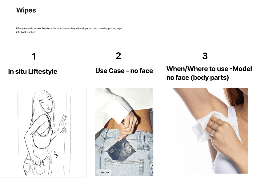
Everyday care, on the go.

Everyday care, on the go.

My hand-drawn wipes storyboard

My hand-drawn wipes storyboard

My hand-drawn wipes storyboard with planning references

FINAL / PHOTOGRAPHY BY CHRISTIAN BLANCHARD

FINAL PHOTOGRAPH

Finished photography by Christian Blanchard, directed by Cara Dunning

Water, texture and a precise product composition.

Water, texture and a precise product composition.

My sketch and AI-created water concept

My sketch and AI-created water concept

My sketch and AI-created water concept with planning references

FINAL / PHOTOGRAPHY BY CHRISTIAN BLANCHARD

FINAL PHOTOGRAPH

Finished photography by Christian Blanchard, directed by Cara Dunning

A considered bathroom moment.

A considered bathroom moment.

My hand-drawn lifestyle storyboard

My hand-drawn lifestyle storyboard

My hand-drawn lifestyle storyboard with planning references

FINAL / PHOTOGRAPHY BY CHRISTIAN BLANCHARD

FINAL PHOTOGRAPH

Finished photography by Christian Blanchard, directed by Cara Dunning

Creative direction, shoot planning and art direction: Cara Dunning. Photography: Christian Blanchard. Developed from the established visual identity.

02 / THE SYSTEM

More products. One clear system.

More products. One clear system.

More products. One clear system.

An expanding range needed a clear organizing principle. With the in-house team and agency partners, I helped develop the product language, icons and colorways that make each product distinct while keeping the family recognizable.

An expanding range needed a clear organizing principle. With the in-house team and agency partners, I helped develop the product language, icons and colorways that make each product distinct while keeping the family recognizable.

After
Before
Before
After
Packaging development / Range, categories and colorways

Development board: mapping the range across supplements, cleansing, odor care and moisturizing products.

Purpose first. Recognition throughout.

Purpose first. Recognition throughout.

The architecture ties a targeted solution to a recognizable icon and color treatment. Control Odor, Cleanse, Soothe and Moisturize create an organizing framework, while the shared identity and pack structure keep the products connected.

2026 product architecture / Internal development reference

PLANNED FOR WHAT COMES NEXT

A new product. A place already planned.

A new product. A place already planned.

When developing the architecture, I anticipated the need for a soothing category that could accommodate future products addressing needs such as itching and yeast-related discomfort. When the anti-itch cream concept entered development, we already had a framework for where it would live and how its colorway and packaging language would connect to the range.

When developing the architecture, I anticipated the need for a soothing category that could accommodate future products addressing needs such as itching and yeast-related discomfort. When the anti-itch cream concept entered development, we already had a framework for where it would live and how its colorway and packaging language would connect to the range.

Anti-itch cream packaging concept showing a soothing-category colorway within the pH-D product architecture

Line-expansion packaging concept. Shown to demonstrate the system’s flexibility, not as evidence of a product launch.

Packaging system development: Cara Dunning with the in-house team and agency partners. Boards and front-panel artwork shown here document development; they do not indicate launch status for every product.

THE ICON WORLD

A language of everyday care.

One illustrated system. Many ways to care.

Pits, folds & fanny
Pits, folds & fanny
Apron tummy
Apron tummy
Sensitive areas
Sensitive areas
Under boobs
Under boobs

02 / THE SYSTEM, CONTINUED

Making care easier to understand.

Making care easier to understand.

Making care easier to understand.

I illustrated a connected language for body areas, life stages, symptoms and ingredients. Line and color treatments carry it from packaging into product education.

I illustrated a connected language for body areas, life stages, symptoms and ingredients. Line and color treatments carry it from packaging into product education.

Icon illustration and commerce design: Cara Dunning. Photography: Christian Blanchard.

03 / THE SYSTEM IN USE

From product page to physical space.

From product page to physical space.

From product page to physical space.

The rollout happened in stages. Photography and the refreshed visual language reached commerce and physical spaces while the previous logo and packaging were still in use.

The rollout happened in stages. Photography and the refreshed visual language reached commerce and physical spaces while the previous logo and packaging were still in use.

A connected commerce experience.

A connected commerce experience.

Art-directed photography and icon illustration work together to explain benefits and everyday use.

Daily comfort commerce content combining icon illustration and photography
Body freshness commerce content combining icon illustration and photography

PDP thumbnail walkthrough. Video plays without audio.

Actual transitional pH-D booth / Photograph enhanced with AI for presentation

I conceived the booth, wrote the copy and designed every element, from the backdrop and banners to the supporting tabletop materials. The imagery came from the shoot I art directed, carrying the photographic world into the space.

I conceived the booth, wrote the copy and designed every element, from the backdrop and banners to the supporting tabletop materials. The imagery came from the shoot I art directed, carrying the photographic world into the space.

Booth concept, copy and design: Cara Dunning. Photography art direction: Cara Dunning. Brand photography: Christian Blanchard. Booth images are photographs of the actual installation, enhanced with AI for presentation.

(02)

(Portfolio)

© 2026

(02)

(Portfolio)

(02)

CON-CRĒT® Creatine

Art Direction/Photography

2026

(03)

Creaboost

Branding

2026